Money too Tight to Mention
Recently, music artists have been claiming that they are not receiving enough money from streaming music services. Yet many of these streaming companies are making a loss. This graphic shows how much the streaming apps pay the music industry and if musicians could potentially earn minimum wage based on how many streams their songs get.

https://informationisbeautiful.net/visualizations/spotify-apple-music-tidal-music-streaming-services-royalty-rates-compared/
The graphic is divided up by 9 music services, all color coordinated, and the average artist revenue per pay. Then based on the total users and the amount that do not actually pay for the music service, it is determined how many plays are necessary for an artist to make minimum wage at $1,472.
This graphic is useful as it is easy to see how each of the music services are able to pay artists and roughly breaks down how much each company is losing due to their services.
I thought this graphic was interesting, because at first glance it is very aesthetically pleasing. The contrast of vibrant almost neon colors against a dark background makes it easy to look at and follow the data.
It is also interesting as it makes you wonder how many of these music companies are able to stay in business. Spotify for example, loses roughly $426 million annually, yet they pay artists on average one of the lowest amounts, $0.0044 per stream.
Spotify also has the second greatest number of total users and just over half pay for a subscription. This shows us that because more people are using this as a streaming service, more artists are getting plays, meaning that the mere $0.0044 per stream adds up to the $426 million annually lost.
Diversity in Tech
Diversity in any business is also a highly debated topic in which globally people are concerned that women and minorities are not accurately represented in large corporations, especially the tech industry which seems to be largely dominated by white males. In the graphic below, it breaks up how many top social media and tech companies are in terms of diversity of employees globally and even compares it with the US population, Kaiser Permanente (largest female employed US company), US Congress, Venture Capitalists, and Fortune 500 CEOs.
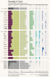
https://informationisbeautiful.net/visualizations/diversity-in-tech-static/
As seen above in the data, every single company is composed of a majority of white males, with the exception of NVIDIA where only 38% of the company is White and 44% is Asian, yet they also contain the lowest number of female employees at 16% (almost half that of every other company).
This graphic easily breaks down gender and ethnicity by company so it is very easy to decipher the demographic of each without necessarily reading the exact percentages.
Personally, I find this graphic interesting as a women who is interested in working in the tech industry, it is good to know what companies support female employees versus and company where I would see very little women representation.
https://informationisbeautiful.net/visualizations/gender-pay-gap/
The original visualization has many components. It has categories based on gender, tech companies, ethnicity, etc. It also uses color to differentiate between some of the information. On top of that you can actually click on it to see the differences between male and female workers. The sideways bar graph is a way of showing the information that is easy to read. The other graph is only really similar in that it is compare a difference between males and females. However the second visualization focuses on the wage gap and not differences in hiring. It uses two different colors to show men and women. And compares their yearly salary with their hourly rate. It is interesting to see that no matter what the job is, male workers are always making at least a couple hundred more dollars than their female counterparts. Just like how in the original graph, it didn’t matter what tech company, there was always more men hired than there were women. Both graphs are conveying that women are at a disadvantage in many aspects of the work field. We are getting closer to being equal, but we still make less money and have harder times getting jobs.
First and foremost, I wish that I had seen this visualization tables sooner because they are definitely shocking, especially the last one. Starting with the first one I do agree with the colors grabbing your attention, cause that’s what immediately stood out to me. Also, while looking at the visualization I noticed some interesting detail I did not know before, such as: Spotify having the second highest amount of user but, they are losing way more than they are making. I was also quite impressed about how you were able to understand the chart so clearly because they give you so much information all at once it’s a little overwhelming. For your second chart I was blown away. People are always taking about gender equality, which I am a hundred percent on board, but I have never seen the statics on it and they are shocking the fact only one company, Kaiser Permanente, has over half female workers is the only company that is the high. Also seeing how many more whites are hired compared to any other ethnicity is criminal. I’m not going to lie seeing that is very frustrating. Both your chart had very appealing data and your writing was very insightful. Thank you for teaching me something new.
https://www.reddit.com/r/dataisbeautiful/comments/923c92/80_of_the_50_largest_public_companies_are/( relation: This visualization collected data for a different purpose but using similar companies)